Posts

(Presentation and Feedback)

Image
Presentation and Feedback This video includes our presentation and our feedback, which we received from other groups in our class who happen to be also making a trailer. When listening to the feedback which we received from the class, I would say that I both agree and disagree with some of the feedback. For example, I agree that we should of added some more establishing shots to show more of the locations which we used, I also agreed that the gun shot which we used in the trailer was effective because it makes the audience want to find out more about the ending of the trailer, leaving them on a cliff hanger. Another example of when I agreed with the feedback was when some said that we should make our music more effective to the genre of our trailer, which I agree with because when watching back we could of changed the music to make it more intense in certain places which would make the trailer feel more like an action thriller trailer. One last piece of feedback which I agreed

(Our final trailer)

Image
Trailer This is our final trailer for our film Race Against Time which we made for our second year in A level media. We decided to come up with the name Race Against Time because our story was to have some body kidnapped and it would be a race against time to find them and make sure that they are safe and alive. Our story involves having a rich business man who wants to get revenge on an old business partner, to do this the rich business man calls up some thugs to kidnap his brother for a money reward. When the brother gets kidnapped the antagonist phones up the protagonist and tells him that he has a certain amount of time to save his brother before its to late, this leaves the protagonist to go onto an adventure to find his brother. 

(Film Magazine Cover)

Image
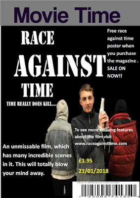
Film Magazine Cover The image above is our film magazine front cover which we made using Microsoft publisher. When researching other magazine front covers we saw that they have a large image which stands out compared to other images which may be on the magazine cover as well, from doing research we also found out that the magazine needs a bar-code, price and the date so people know how much the magazine costs and when the magazine was released. Our magazine also has some extra information on it like our website so people can find out more information about the film, and as well the magazine includes a free film poster which could draw the customers in to buying the magazine. Our main image that we used was really effective because it covers most of the magazine which means that it can be clearly seen, the image also shows you some of the characters in the trailer which means that it gives you an idea of the characters which are in the trailer. The bold text of the magazines na

(Film Poster)

Image
Our film poster The image above is our rough film poster which we created on a piece of paper. This rough poster will give us an basic idea of how we will layout our information onto our poster. This image above is our final poster for our trailer Race Against Time.

Evaluation 4

Image
How have used media technologies in the construction and research, planning and evaluation stages? · Comment on your influences. In your planning where did you take some inspiration from and how did this become realised in your final productions. Include some snips and analyse in detail. We took inspiration from the film Taken which is a well know franchise which was first introduced 2008 which stared Liam Neeson and was directed by Pierre Morel, with the last of the three films being released in 2014. We took inspiration from this film because we had an idea from what our trailer was going to be about which included someone being kidnapped for what there brother has done as a kind of revenge attack. We realised in our final production that we took inspiration from the film Taken because our story line was based on a business man being held to ransom by kidnappers who took his brother because of a deal that went wrong with his past business partner.  In this image you can see

(Evaluation 3)

Image
What have you learnt from your audience feedback? · Create a questionnaire that asks your audience what they thought about narrative, characters, branding and use of technical skill in your productions and evaluate the findings. From this example questionnaire I found out what people thought of our trailer. When looking at the results for the first question I found out that the audience enjoyed our narrative because it was simple to follow as the narrative was to the point and not complicated. For the second question I found out that the audience liked the way the characters where presented this was because of the way the characters fit into the roles set in the trailer. I also found out that the audience liked the costumes used in the trailer because they complemented the characters for the time period it was set in, as well it separated good characters from the bad ones in this trailer. I found out that for question three the audience enjoyed the way I used the poster and maga